SAMPLE WEBSITE REVIEW · FICTIONAL SHOP

Sample review:
a fictional candle shop.

This report shows five issues found in a fictional candle shop. For each issue, you can see the problem, the suggested change and how it could help customers.

EXAMPLE ISSUE Fictional candle shop

Show the scent of each candle.

The product list does not describe the scents.

CedarNo scent listed
FigNo scent listed
LinenNo scent listed

Suggested change: add a scent description.

CedarCedar & amber
FigGreen fig & woods
LinenLinen & white tea
Read the full explanation ↗

A fictional example of the review you receive.

TOPICS IN THIS SAMPLE

Address first

Let customers change the quantity.

The problem

The product page selects three candles by default. Once they are added to the cart, the quantity cannot be changed.

Quantity

3 items

The cart only has a Remove button.

Suggested change

Start at one candle. Add + and − buttons so customers can change the quantity in the cart.

Quantity

− 1 item +

Change quantity in the cart

How this could helpCustomers could choose how many candles to buy and correct a mistake without removing the item.

These drawings illustrate the suggested changes. They have not been implemented or tested.

See the original screenshots and review details

These screenshots are from the fictional shop. Candle prices are example data; the website review fee is US$59.
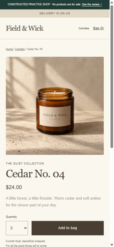
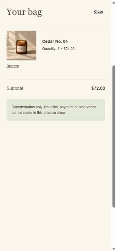
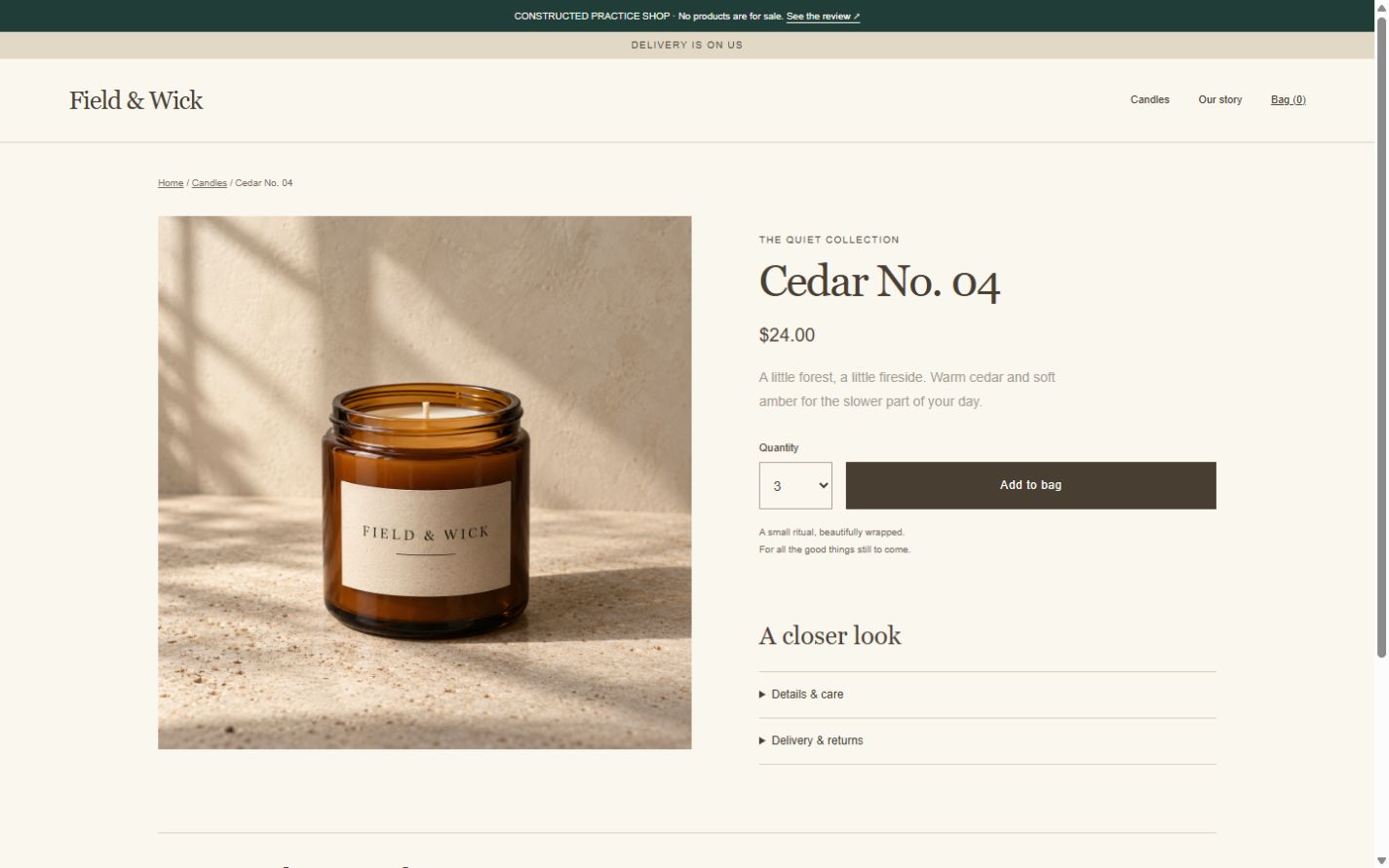
Starting quantity on the product pageOriginal ↗
Actual browser capture of starting quantity on the product page; numbered reviewer annotations are a separate layer.
12
Controls in the shopping cartOriginal ↗
Actual browser capture of controls in the shopping cart; numbered reviewer annotations are a separate layer.
3
  1. 1

    Default quantity: three candles

    The quantity starts at three, although the displayed $24 is the price of one candle.

  2. 2

    Add to bag does not show the selected total

    The button does not explain that the selected three candles add $72.

  3. 3

    No quantity control in the cart

    Customers can remove the item, but cannot change its quantity in the cart.
What I found

Each candle costs $24 in this fictional shop. The product page starts at three candles. Clicking Add to bag adds three candles with a $72 subtotal. The cart only has Remove; it has no way to change the quantity.

Why it could confuse customers

A customer expecting one candle could add three by mistake. To correct it, they must remove the item, close the cart and add it again with the right quantity. No actual lost sale was measured.

What I suggest changing

Start at one candle. Beside Add to bag, show how many candles will be added and their total price. Let customers change the quantity directly in the cart.

How to see the issue in the sample shop

Open the sample product page and click Add to bag without changing the quantity. Look for a way to change the quantity in the cart. To get one candle, remove the item, select one on the product page and add it again.

How to check the change

After making the change, add one candle and check that the subtotal is $24. Change the quantity to two and check for $48, then reduce it to one and remove it. Also check the controls with a keyboard and in a narrow browser window.

What the work involves

Change the starting quantity, show the selected total and add a quantity control to the cart. Then check that they work together.

Address first

Explain delivery charges before checkout.

The problem

The top of the site says delivery is free. The policy says it is free only for some orders, and the cart does not show delivery charges.

“Delivery is on us.”

Item subtotal

No delivery charge is shown.

Suggested change

Explain which orders qualify for free delivery beside the promise. Show the delivery charge or explain how it will be calculated in the cart.

Free delivery: explain the conditions.

ItemsDelivery chargeOrder total

How this could helpCustomers could see whether delivery will cost extra before they decide to buy.

These drawings illustrate the suggested changes. They have not been implemented or tested.

See the original screenshots and review details

These screenshots are from the fictional shop. Candle prices are example data; the website review fee is US$59.

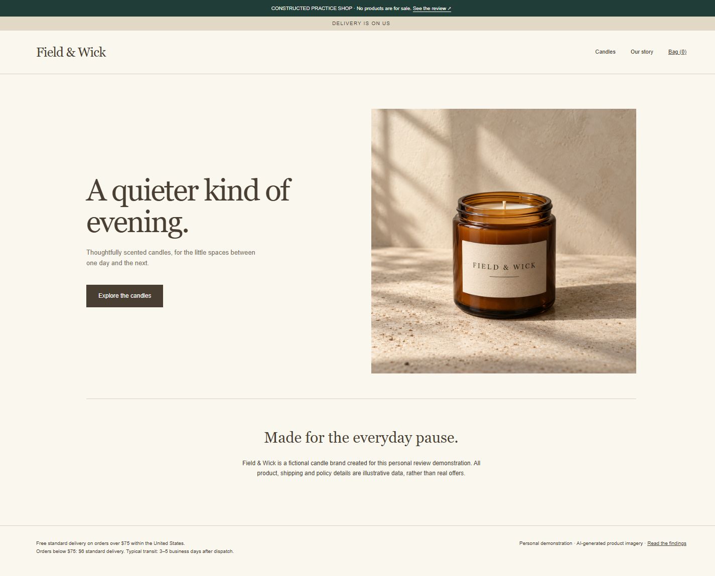
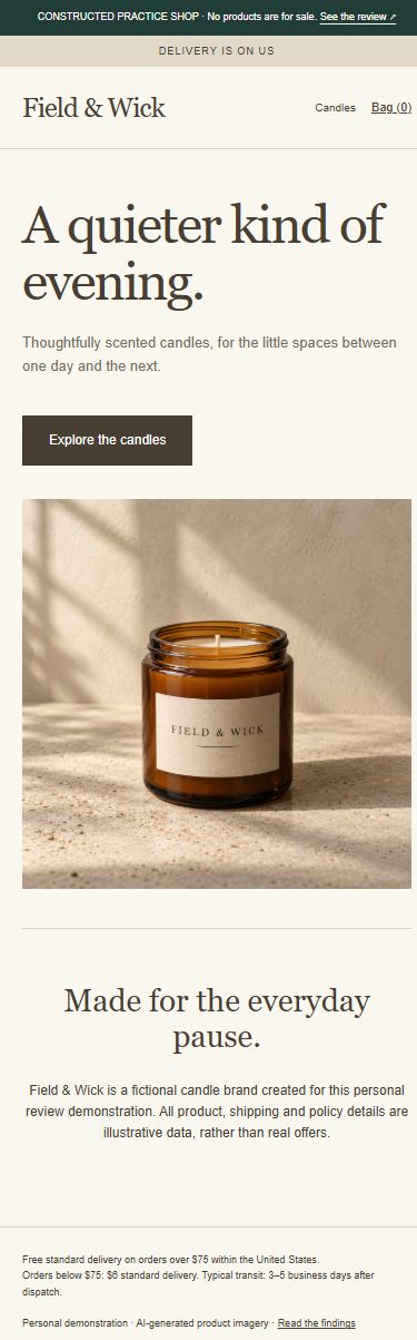
Delivery promise at the top of the homepageOriginal ↗
Actual browser capture of delivery promise at the top of the homepage; numbered reviewer annotations are a separate layer.
4
Delivery policy in the footerOriginal ↗
Item subtotal in the cartOriginal ↗
Actual browser capture of item subtotal in the cart; numbered reviewer annotations are a separate layer.
6
  1. 4

    Free-delivery promise has no conditions

    The banner does not mention the order minimum or delivery destination.

  2. 5

    Delivery charges appear in the footer

    The footer says US delivery is free over $75, and costs $6 below $75.

  3. 6

    Cart does not show delivery charges

    The $72 subtotal covers the items; no delivery amount or destination rule is shown beside it.

What I found

The top banner says “Delivery is on us”. The footer says standard US delivery is free only for orders over $75, and costs $6 below that amount. The cart shows a $72 item subtotal but no delivery charge.

Why it could confuse customers

A customer could expect free delivery after reading the banner. Under the fictional policy, $72 plus $6 delivery would be $78 before tax. This is a calculation from the policy; a checkout charge was not tested.

What I suggest changing

State the delivery destination and free-delivery minimum beside the banner promise. In the cart, show the correct delivery estimate or explain the step used to calculate it.

How to see the issue in the sample shop

Compare the delivery banner with the footer policy. Add the product using its default quantity, then compare the $72 cart subtotal with that policy.

How to check the change

Check that the banner, policy and cart explain the same rules. In a real shop, arrange a checkout check with the owner for orders below and above the free-delivery minimum and for supported destinations. No checkout was tested in this sample.

What the work involves

Update the delivery wording and add the correct delivery charge, estimate or calculation step beside the cart subtotal.

Address next

Explain how to request a return.

The problem

The return policy lists the conditions, but does not tell customers how to request a return.

Delivery & returns

The policy lists return conditions.

No instructions for requesting a return.

Suggested change

Put a return-request link or contact address beside a short summary of the return conditions.

Delivery & returns

Return time limit, conditions and postage.

Request a return ↗

How this could helpCustomers would know who to contact and what to do if they need to return an item.

These drawings illustrate the suggested changes. They have not been implemented or tested.

See the original screenshots and review details

These screenshots are from the fictional shop. Candle prices are example data; the website review fee is US$59.

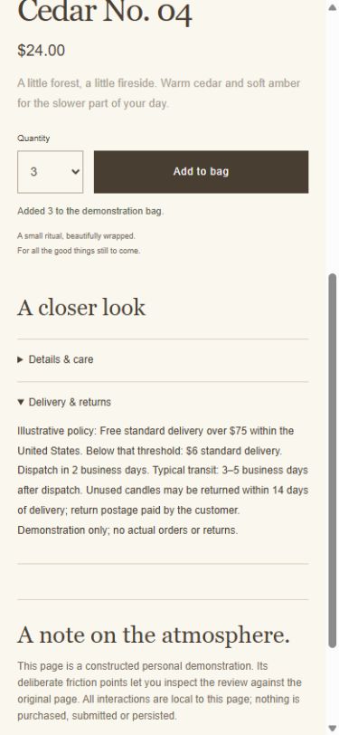
The open delivery and returns policyOriginal ↗
Actual browser capture of the open delivery and returns policy; numbered reviewer annotations are a separate layer.
789
  1. 7

    Delivery timing is inside the policy

    The policy distinguishes dispatch time from the time the parcel spends in transit.

  2. 8

    Returns have a time limit and postage cost

    The policy allows unused returns within 14 days, with return postage paid by the customer.

  3. 9

    No instructions for starting a return

    The policy has no return-request link or instructions.

What I found

Delivery & returns is in a closed section below Add to bag. It says dispatch takes two business days, followed by three to five business days in transit. Unused candles may be returned within 14 days, and the customer pays return postage. It gives no instructions for requesting a return.

Why it could confuse customers

Customers must open the lower section to find the timing and return conditions. Even after reading it, they are not told how to start a return. This review does not assess legal compliance.

What I suggest changing

Put a short delivery and returns summary near Add to bag. Distinguish the time before dispatch from the time in transit. Explain the return conditions and postage cost, and add the owner’s confirmed return-request link or contact address.

How to see the issue in the sample shop

On the product page, open Delivery & returns below Add to bag. Read the policy and look for instructions or a link to request a return.

How to check the change

Confirm the policy with the owner. Check that customers can find the delivery timing, return time limit, item conditions, postage cost and contact step. Check the route without submitting a real return or private information.

What the work involves

Ask the owner to confirm the policy, add a short summary and provide the correct return-request link or contact address.

Address after cart and delivery issues

Show the scent of each candle.

The problem

The product list shows candle names and prices, but does not describe the scents.

CedarNo scent listed
FigNo scent listed
LinenNo scent listed

Suggested change

Add a short scent description under each candle, so customers can compare them on the same page.

CedarCedar & amber
FigGreen fig & woods
LinenLinen & white tea

How this could helpCustomers could compare the scents without opening every product page.

These drawings illustrate the suggested changes. They have not been implemented or tested.

See the original screenshots and review details

These screenshots are from the fictional shop. Candle prices are example data; the website review fee is US$59.

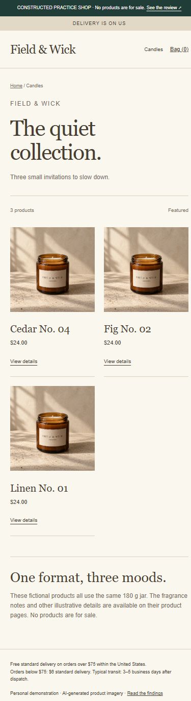
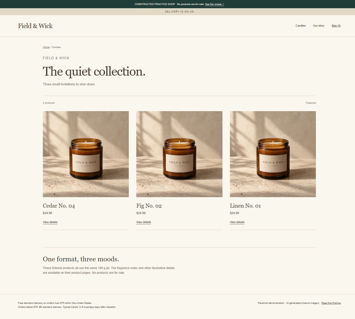
Product list: candle descriptions and linksOriginal ↗
Actual browser capture of product list: candle descriptions and links; numbered reviewer annotations are a separate layer.
101112
  1. 10

    No scent descriptions on the product cards

    Customers must open the individual product pages to read about the scents.

  2. 11

    Every product link says View details

    Including the candle name would make each link clearer.

  3. 12

    Three scents use the same photograph

    The repeated photograph does not help customers distinguish the scents.

What I found

The product list shows candle names and $24 prices, but no scent descriptions. Every link says View details, and the cards reuse one photo. The individual pages describe different scents. The Fig and Linen links were checked and opened the correct products.

Why it could confuse customers

Customers must open individual product pages to compare scents. Repeated link text and photos give them little additional help. The checked product links worked; no broken product link is claimed.

What I suggest changing

Add each confirmed scent description and the 180 g weight to its card. Include the product name in each link’s accessible label. Use photos that represent each candle accurately, or make the scent difference clear in the text.

How to see the issue in the sample shop

Compare the cards on the product-list page. Open Fig and Linen and compare the information on their pages with their cards.

How to check the change

Check the product list in a wide and narrow browser window. Confirm that each name, scent, image, price and link matches the product page. Check whether the scents can be compared without opening all three products.

What the work involves

Confirm each scent description, add it to the product list and give each product link a clear name. Check that the photos represent the products accurately.

Address after cart and delivery issues

Put product details beside the price.

The problem

The product page shows the price near the top. Customers must open a section lower down to find the candle’s weight and materials.

Cedar Candle

Product price

Weight and materials are further down.

Suggested change

Show the weight, wax type, wick and approximate burn time beside the product name and price.

Cedar Candle

180 g · Soy-wax blend

Product price

How this could helpCustomers could understand what they are buying before adding it to the cart.

These drawings illustrate the suggested changes. They have not been implemented or tested.

See the original screenshots and review details

These screenshots are from the fictional shop. Candle prices are example data; the website review fee is US$59.

Product details beside the priceOriginal ↗
Actual browser capture of product details beside the price; numbered reviewer annotations are a separate layer.
13
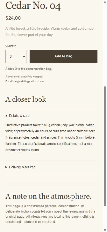
Product details in the lower sectionOriginal ↗
Actual browser capture of product details in the lower section; numbered reviewer annotations are a separate layer.
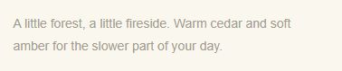
The pale product descriptionOriginal ↗
  1. 13

    Basic product details are below Add to bag

    The weight, wax, wick and approximate burn time appear only in Details & care.

  2. 14

    Description text is pale

    Its calculated contrast ratio is 2.55:1. This is a check of one text element.

What I found

The top of the product page shows a price and a short description. Weight, wax, wick and approximate burn time are only in Details & care lower down. The description is pale: its text and background colours give a calculated contrast ratio of 2.55:1.

Why it could confuse customers

Customers need another step to find the basic product details. The pale description may also be difficult to read. This contrast check covers one text element, not the whole shop.

What I suggest changing

Show the confirmed weight, wax, wick and approximate burn time beside the price. Keep the longer care instructions below. Use a darker text colour for the description; the proposed #655A4D on the existing background calculates to 6.28:1.

How to see the issue in the sample shop

Compare the information beside the price with Details & care. Inspect the text and background colours in the page styles, rather than sampling colours from a screenshot.

How to check the change

Confirm product details with the owner and check them at both browser widths. Recalculate contrast using the final text and background colours. The linked W3C guidance gives a 4.5:1 minimum for ordinary text.

What the work involves

Move the confirmed product facts beside the price. Darken the description text and check that it is readable.

W3C: Understanding WCAG 2.2, 1.4.3 Contrast (Minimum)

How this sample was made and checked

Field & Wick is a fictional candle shop created to demonstrate this service. Its products, prices and policies are sample data. The example includes deliberate problems for the review to find. I prepared the report with AI assistance and checked it against the sample pages. It is not paid client work.

The homepage, product list and one product page, including its shopping cart.

I checked the shop in a Chromium browser at desktop and mobile widths: 1440 × 900 and 390 × 844 CSS pixels. The mobile view was a resized browser, not a physical phone. I opened the delivery and returns policy, changed the quantity and checked that the Fig and Linen links opened the correct products. The numbered boxes were added to screenshots to show the areas discussed. I did not use customer interviews, sales data or a live purchase.

The suggested changes have not been implemented or tested with customers. The priority order is my judgement, not a measurement of lost sales. This is not a full accessibility, legal, security or performance audit. The shop cannot take orders. Any totals calculated from its delivery policy are examples, not verified checkout charges.

REQUEST THIS SERVICE

Request a review
of your store.

Send your public store link. I’ll confirm the pages, delivery date and payment before you order. Your report includes up to five issues, with screenshots and suggested changes.

Website review fee · US$59 ↗

The example above is not client work. The shop is fictional, and the suggested changes have not been tested with customers.